LŌM
From nature to skin. Made for everyday Saudi homes.
From nature to skin. Made for everyday Saudi homes.
- Project Type
- Brand Strategy & Identity
- Industry
- Beauty & Personal Care
- Location
- Saudi Arabia
- Services
- Brand Strategy · Market Research · Naming · Brand Identity · Packaging · Copywriting · Web Design
LŌM
LŌM is a natural skincare and soap brand rooted in the Saudi landscape. Born from a desire to bring pure, locally inspired ingredients into everyday households, LŌM celebrates the richness of Arabian botanicals — from oud wood and rose water to black seed and desert herbs. The brand sits at the intersection of Saudi heritage and modern self-care.
The Challenge
Entering the Saudi skincare market meant navigating a crowded space dominated by international giants and luxury imports — with very little room for an authentic local voice. There was no strong natural skincare brand rooted in local identity, and the target audience — everyday Saudi families — were seeking affordable but elevated alternatives that felt genuinely theirs.
The Sensory Experience
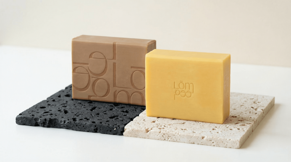
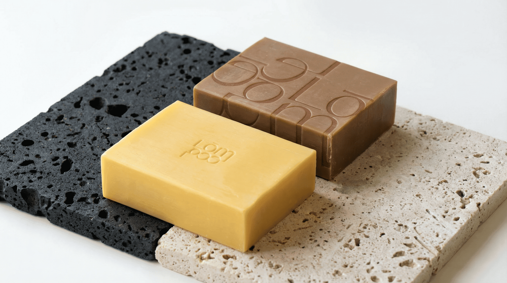
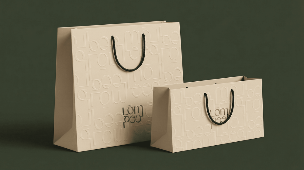
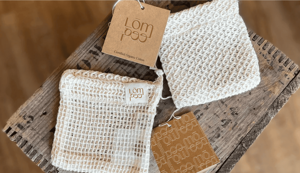
Warm earth tones, creamy whites, botanical line illustrations, and minimal packaging.
Oud, rose water, black seed, and desert herbs scent names written poetically.
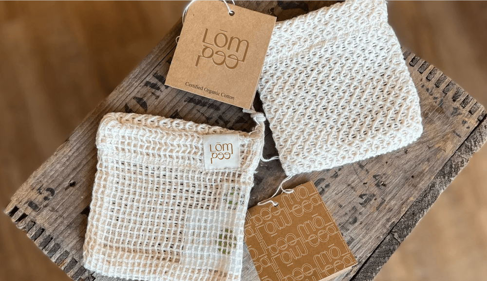
Natural kraft textures, soft-touch finishes, and rounded organic shapes.
Comfort. Pride. The quiet satisfaction of choosing something made for them.
The Approach
- 01Strategy
Positioned LŌM as the premium-accessible natural skincare brand for everyday Saudi families not a luxury import, not a mass-market compromise.
- 02Brand Direction
Rooted in Arabian botanicals and Saudi heritage, with a modern, honest visual voice that feels crafted rather than manufactured.
- 03Visual Language
Earth tones, botanical illustrations, organic forms, and handcrafted textures across every touchpoint from packaging to social.

The Work
From strategy to shelf-ready brand, every piece was built with the same intention: create something LŌM's audience would recognize as theirs.
Brand naming development · Naming exploration & evaluation · Brand story alignment
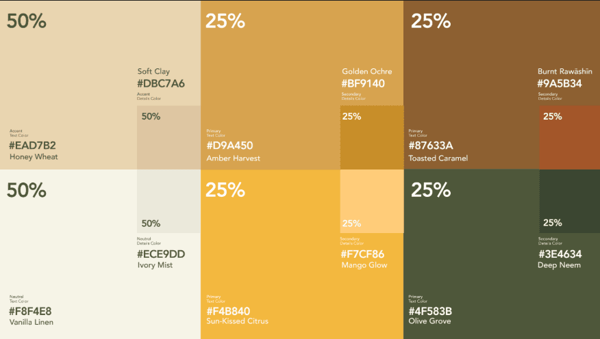
Logo design & identity system · Color palette & typography · Brand guidelines
Botanical pattern library · Earth tone color system · Texture assets
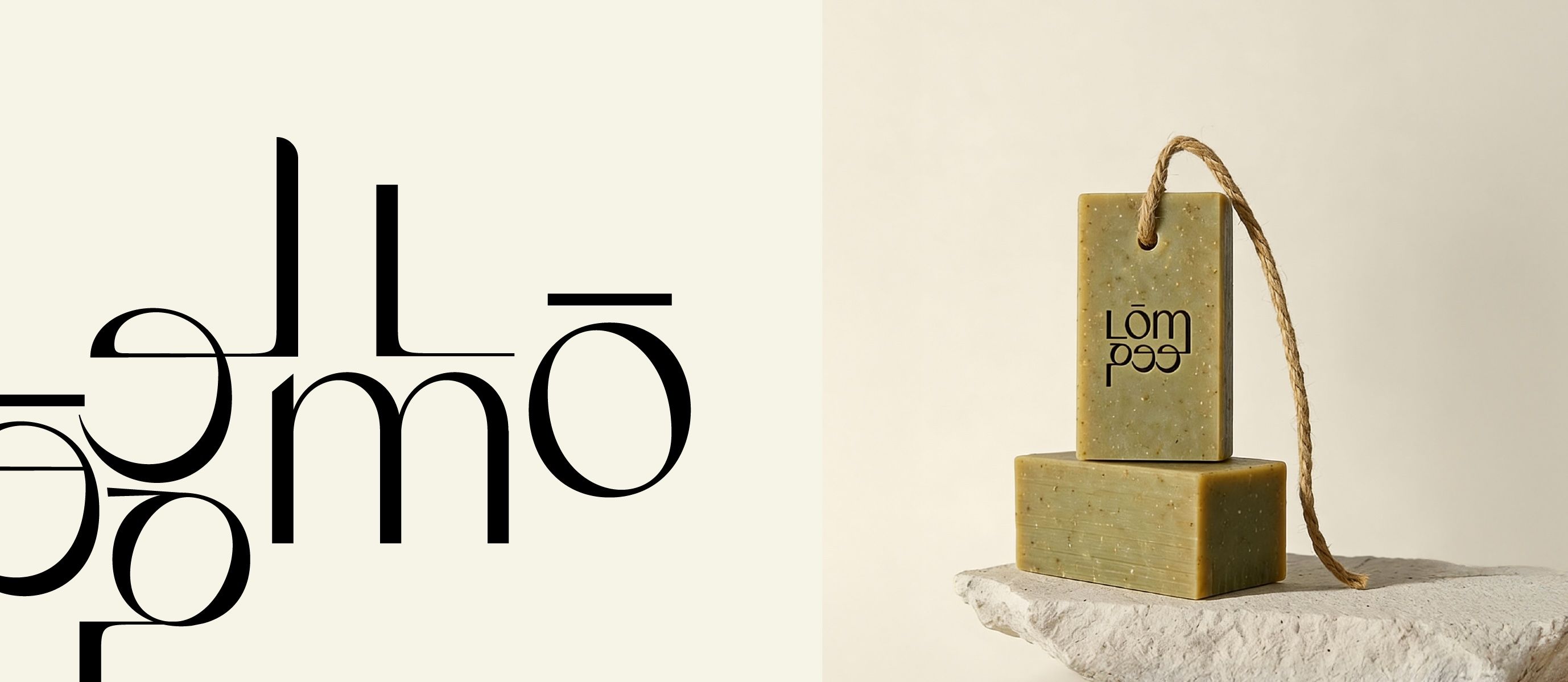
Primary logo · Secondary logomark · Arabic adaptation
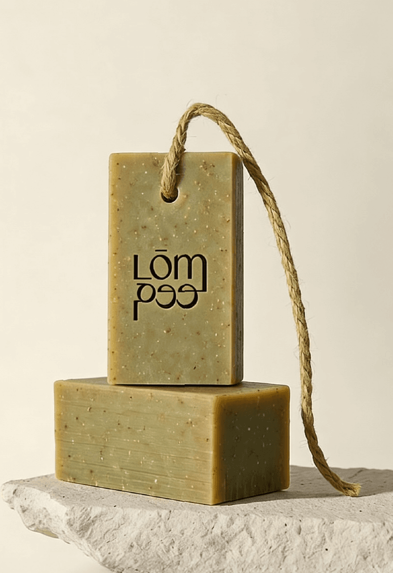
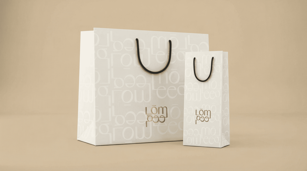
Soap packaging design · Skincare range packaging · Label system
Social media templates · Content guidelines · Photography direction
Brand photography direction · Copywriting & tone of voice · Market research report
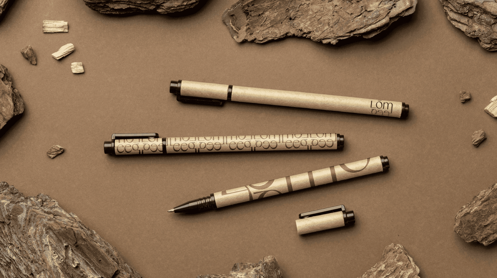
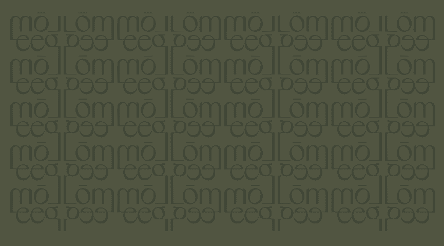
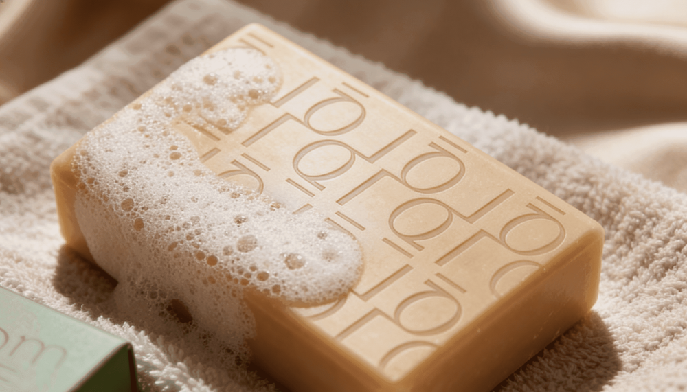
Every element of LŌM was designed to be immediately recognizable on shelf and screen. The typographic system balances English and Arabic with equal elegance — a deliberate choice for a brand that needed to feel at home in both languages from day one.
Results / Impact
- 01
Stronger digital to physical experience
- 02
Brand consistency across all platforms
- 03
Clear brand positioning in the Saudi market
- 04
Premium quality communicated at an accessible price point
- 05
A naming and identity system that scales from labels to retail signage