
MARISOL
Sunshine in a bottle.
Sunshine in a bottle.
- Project Type
- Brand Creation & Product Launch
- Industry
- Fragrance & Beauty
- Location
- Saudi Arabia
- Services
- Brand Strategy · Brand Positioning · Brand Story · Tagline Development · Tone of Voice · Visual Identity · Logo Design · Color System · Typography System · Iconography · Pattern Design · Packaging Design · Stationery Design · Brand Applications · Photography Direction · Sensory Brand Direction · Brand Guidelines
MARISOL
MARISOL is a fresh unisex fragrance brand inspired by the meeting point of sun, sea, and everyday ease.
The Challenge
MARISOL needed to enter a crowded fragrance market with a clear identity that could feel premium without becoming formal, heavy, or distant. The challenge was to create a brand that would stand out in Saudi Arabia and the GCC while remaining fresh, unisex, approachable, and relevant to everyday life.
The Sensory Experience
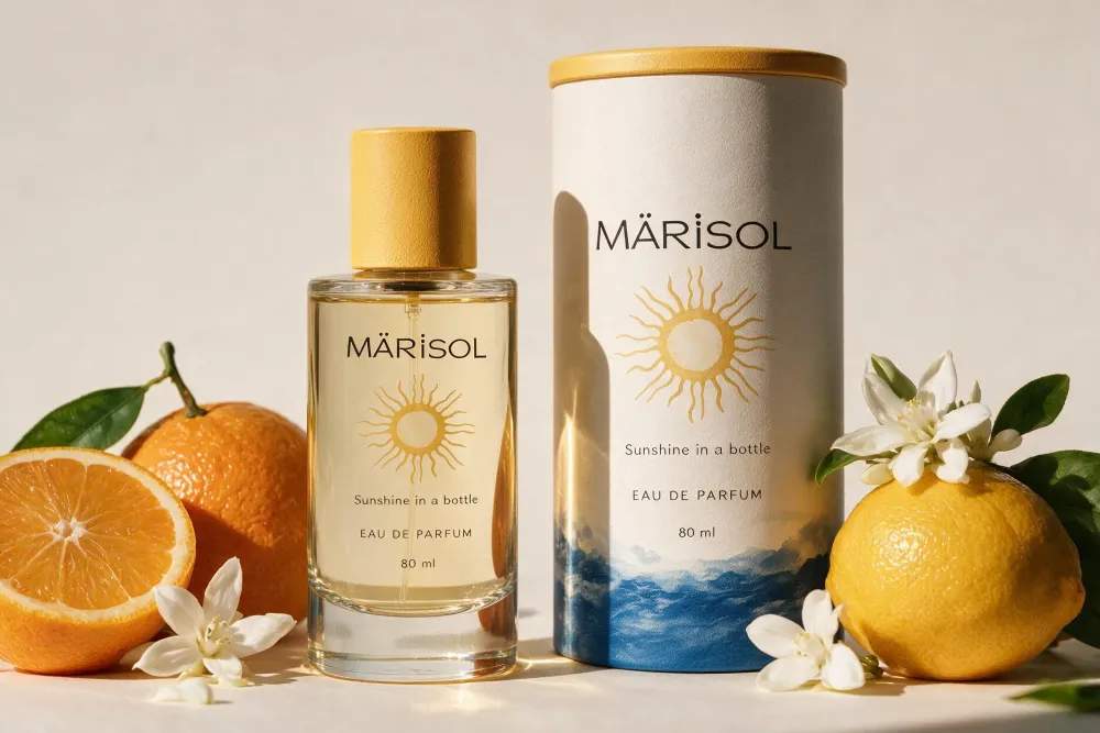
Sunlit blue, warm yellow, moving water, soft shadows, citrus and natural textures.
Waves, a soft breeze, distant movement, relaxed everyday summer sounds.
Fresh citrus, sea air, clean skin, warmth and lightness.
Cool glass, soft linen, textured paper, smooth finishes.
Fresh, warm, light and effortlessly joyful.
The Approach
- 01Strategy
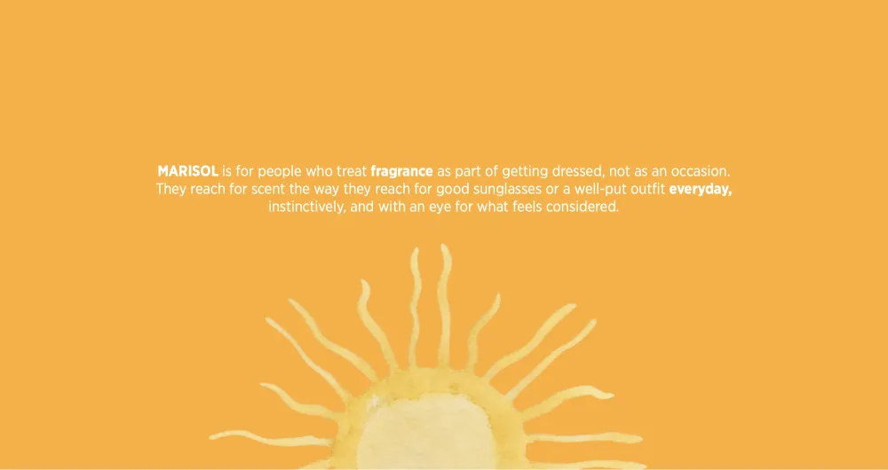
Moving fragrance away from being occasion-led or overly formal and into everyday life. From audience and positioning to brand promise, tone of voice, and emotional territory.
- 02Brand Direction
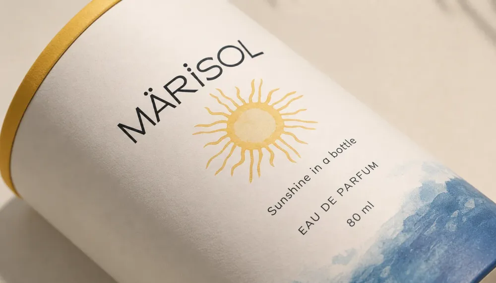
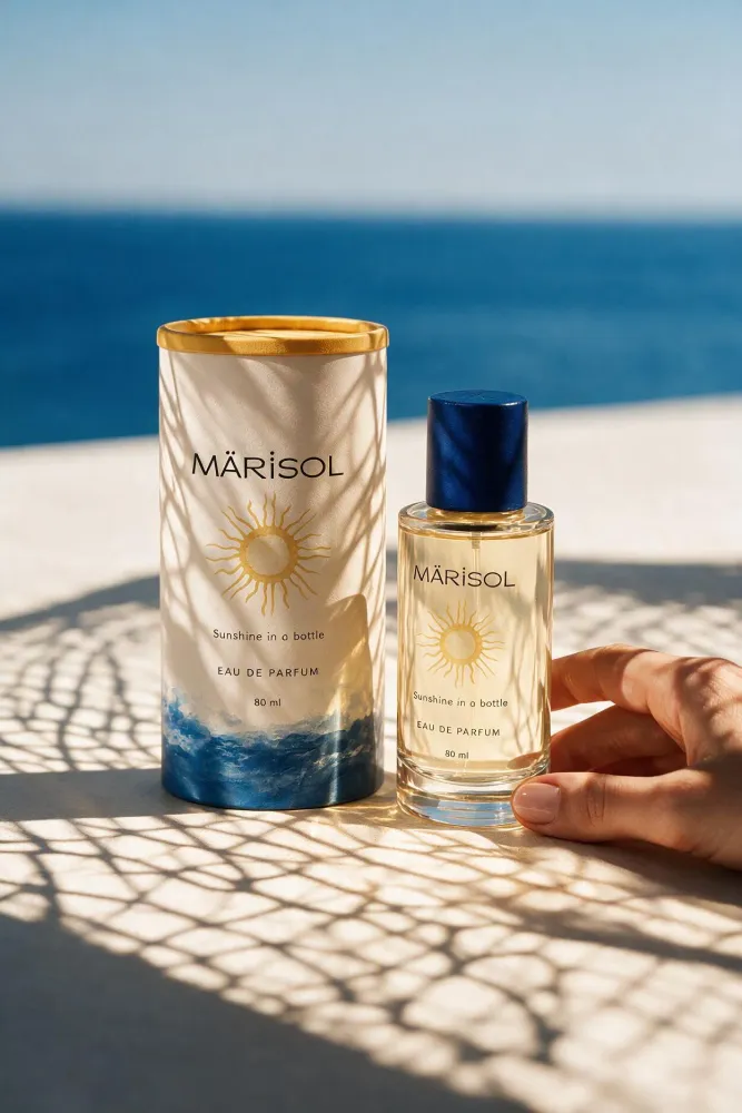
We built MARISOL around one clear brand direction: sun, sea, freshness, and everyday ease.

The Work
Competitor Analysis · Market Positioning · Brand Positioning · Target Audience · Brand Essence · Mission & Vision · Brand Promise · Brand Values · Brand Personality · Tone of Voice · Brand Story · Tagline Development
Logo Design · Wordmark · Brand Emblem · Color System · Typography System · Pattern Design · Iconography · Watercolor Illustration Direction
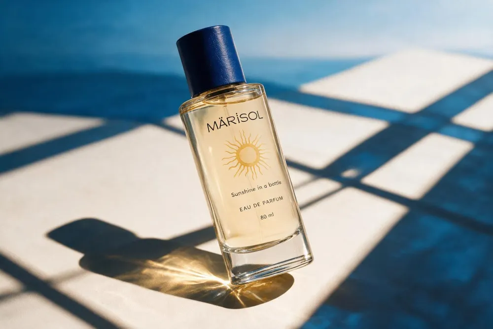
Conceptual Packaging Design · Packaging Direction · Product Label Direction · Stationery Design · Brand Applications · Gifting Applications · Retail Applications
Photography Direction · Visual Direction · Sensory Brand Direction · Material & Texture Direction · Lifestyle Art Direction
Logo Usage · Clear Space & Minimum Size · Logo Misuse Guidelines · Color Specifications · Typography Guidelines · Visual System Guidelines · Photography Guidelines · Tone of Voice Guidelines · Brand Application Guidelines
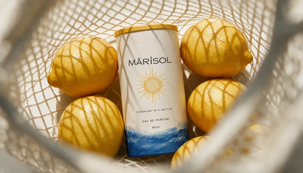
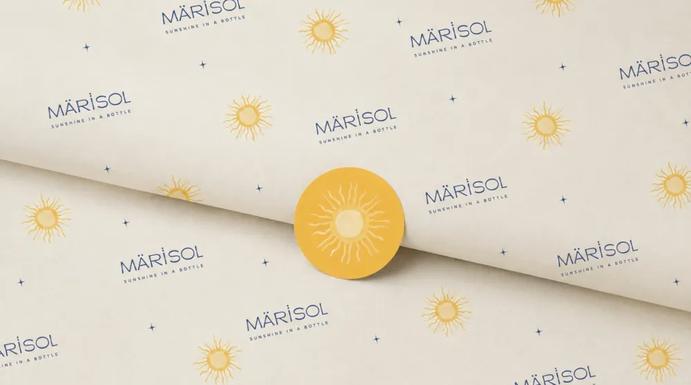
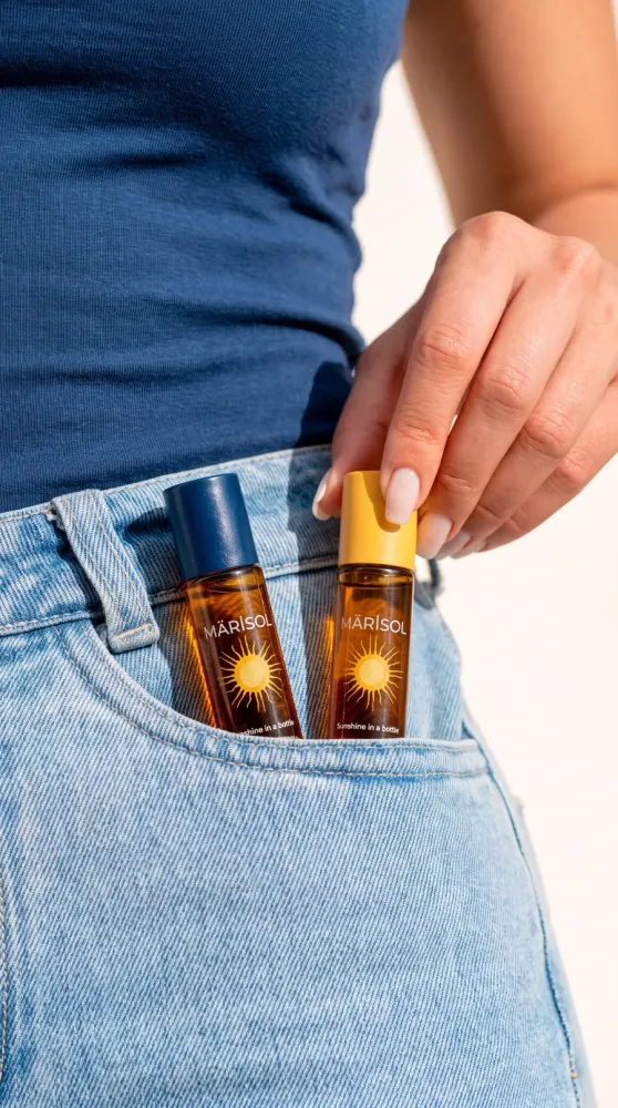
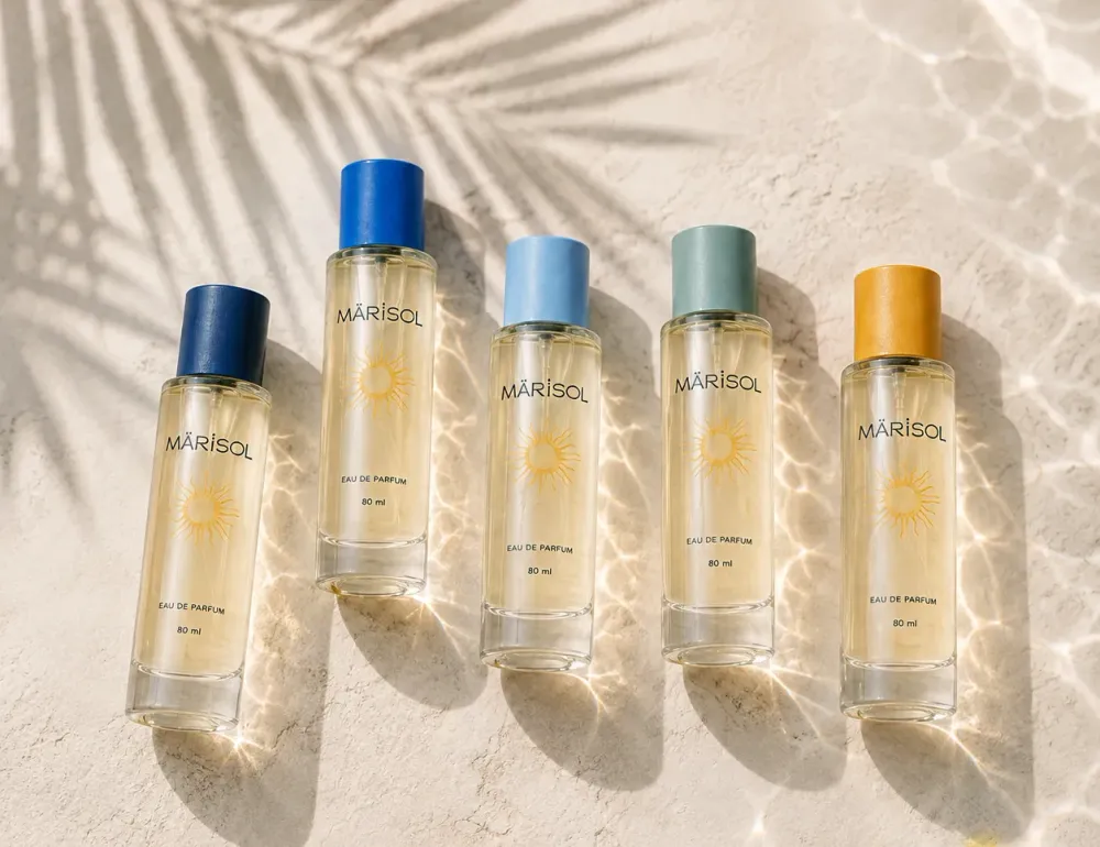
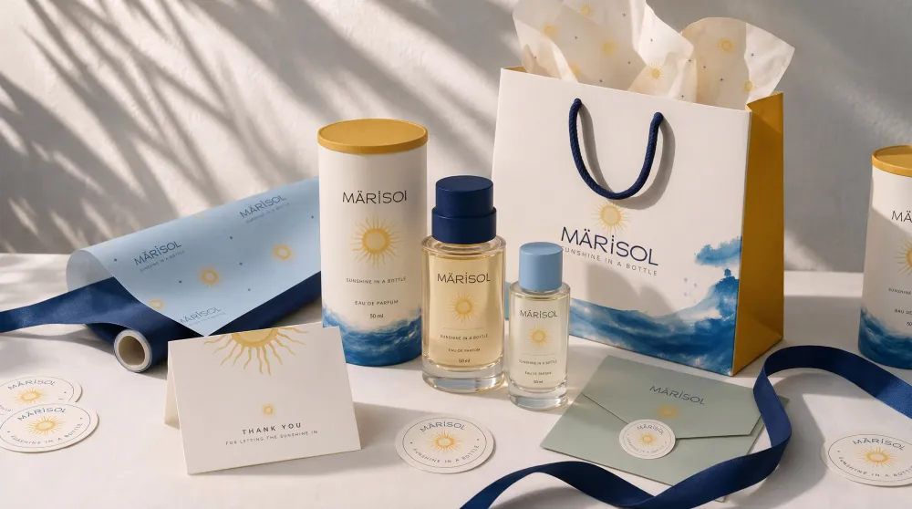
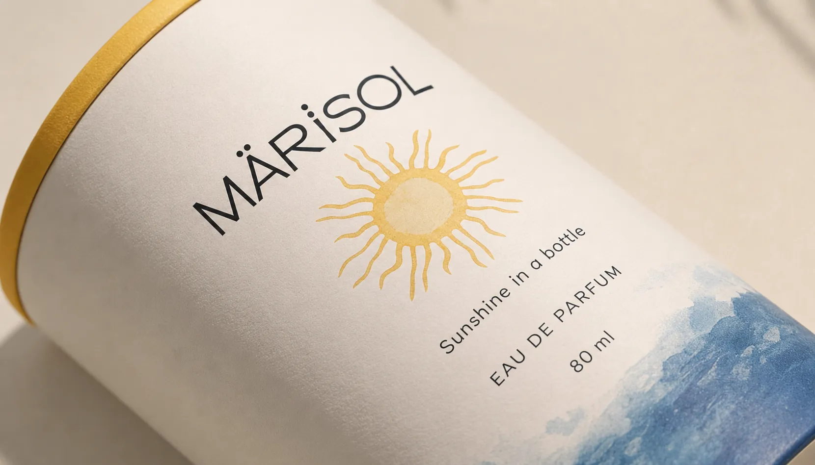
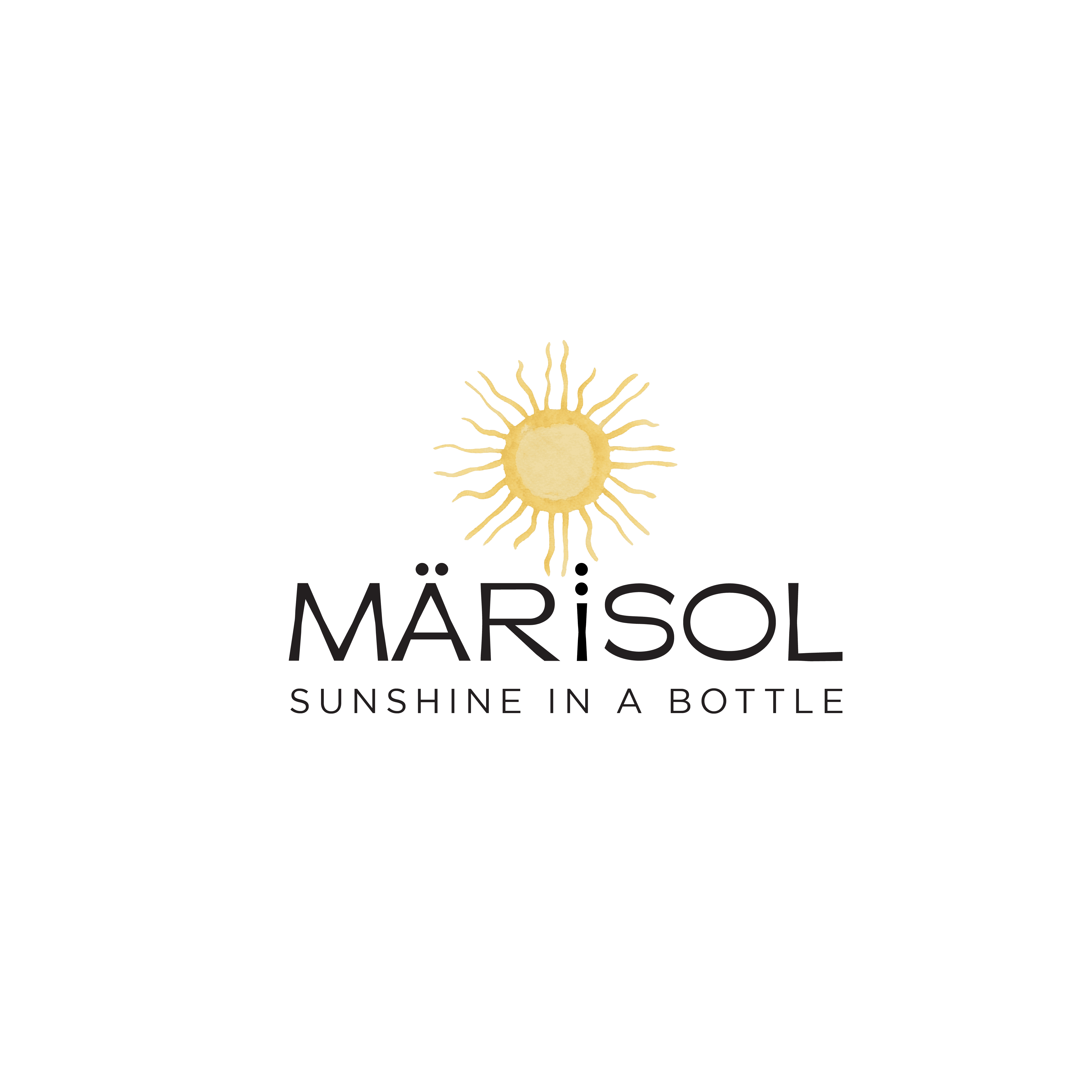
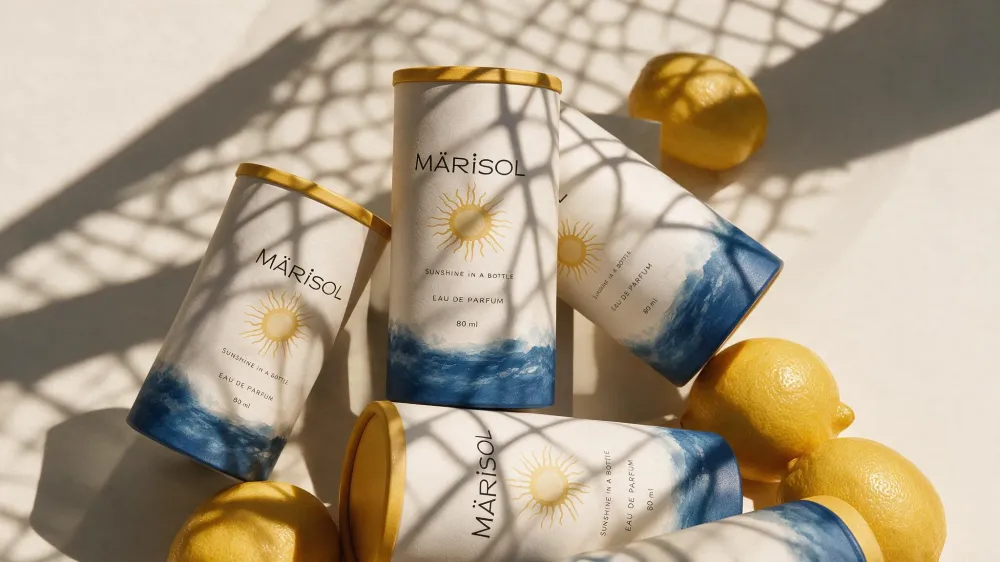
The system combines a refined wordmark, hand-drawn sun emblem, Mediterranean-inspired color palette, typography, patterns, watercolor iconography, photography direction, sensory cues, and conceptual packaging. Each element was designed to work together across fragrance products, gifting, retail, digital, and everyday brand touchpoints while maintaining one consistent feeling: effortless freshness, warmth, and optimism.
Results / Impact
- 01
Built a clear premium everyday fragrance position for the Saudi and GCC market
- 02
Created a distinctive identity rooted in sun, sea, freshness, and movement
- 03
Developed a flexible visual system across packaging, digital, retail, and gifting
- 04
Established a consistent brand voice, sensory direction, and photography language
- 05
Created a scalable foundation for future products, campaigns, and brand growth